|
|
|
|
|
|
|
|
|
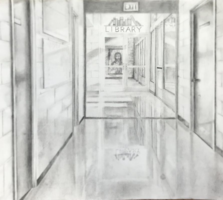
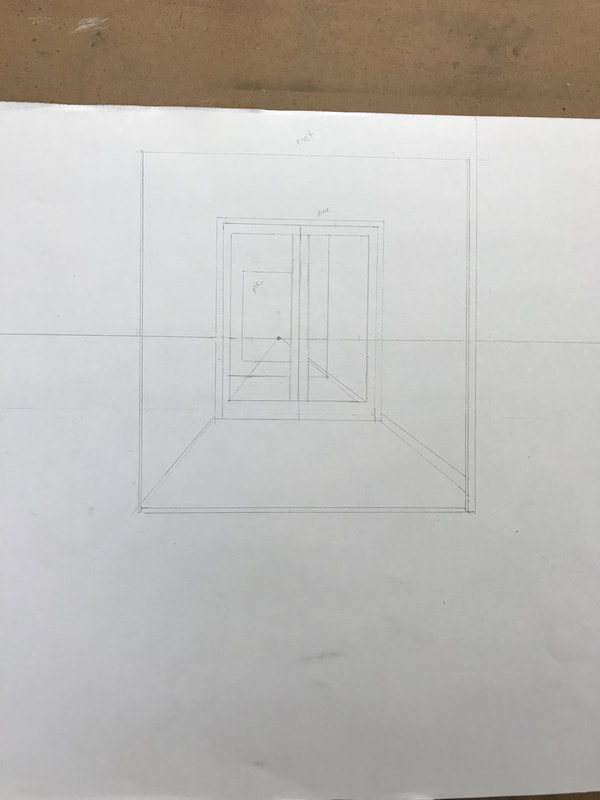
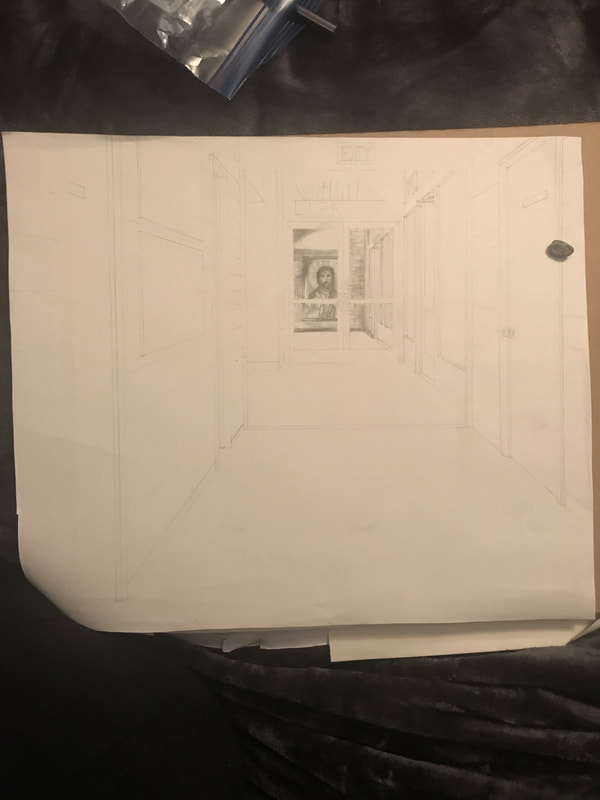
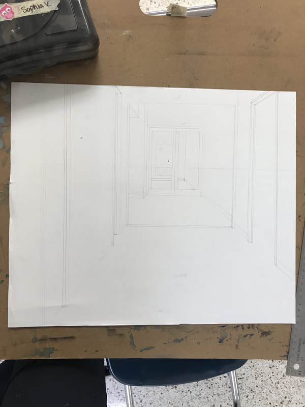
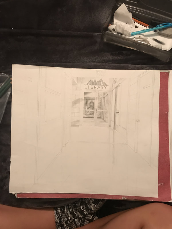
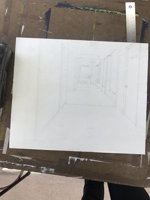
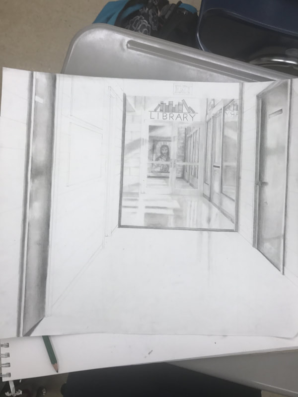
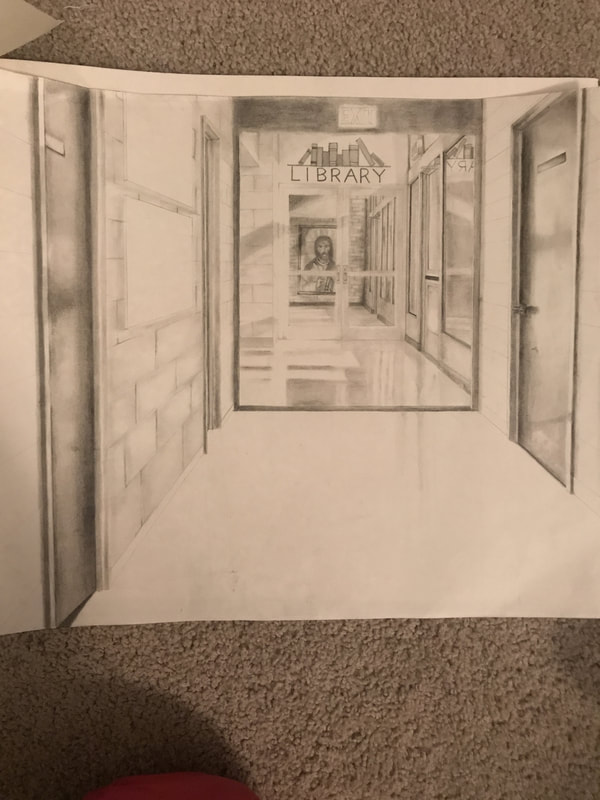
Cornerstone
This piece depicts a hallway highlighted by morning sun. The passage runs through double doors and is lined with windows. I used value in creating the depth of the sun’s shadows and highlights. Texture came into play as I moved to adding reflections in the floor. My goal was to create a glass-like image. Emphasis was placed on the center of the hallway: a painting of Jesus. The contrast of the straight lines to the curvy, blended lines used in the painting was intended to draw a viewer’s eye to the center. The meaning behind the title of the piece, Cornerstone, lies in the center of the image. Jesus is often referred to as the “Cornerstone,” in many scriptural passages, and I saw it fit to use Him in that way by centering the image around HIm. I wanted to incorporate an image greater than a simple hallway into my work.
|
|
|
|
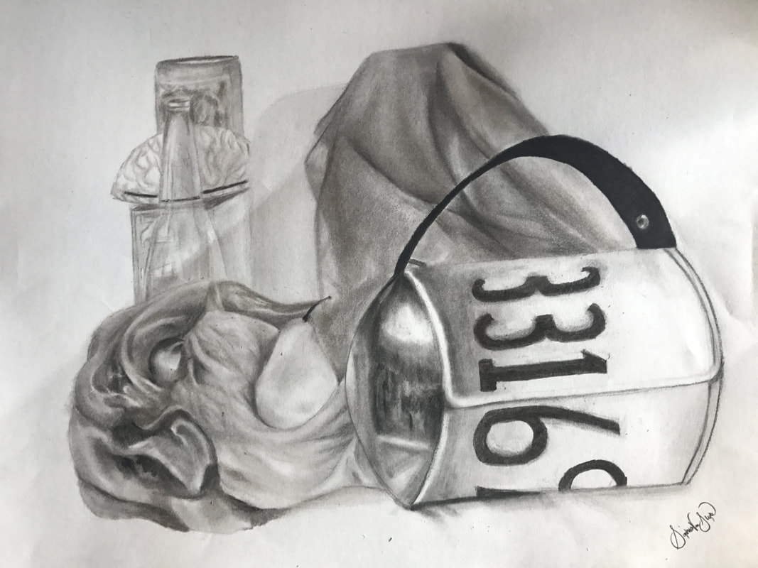
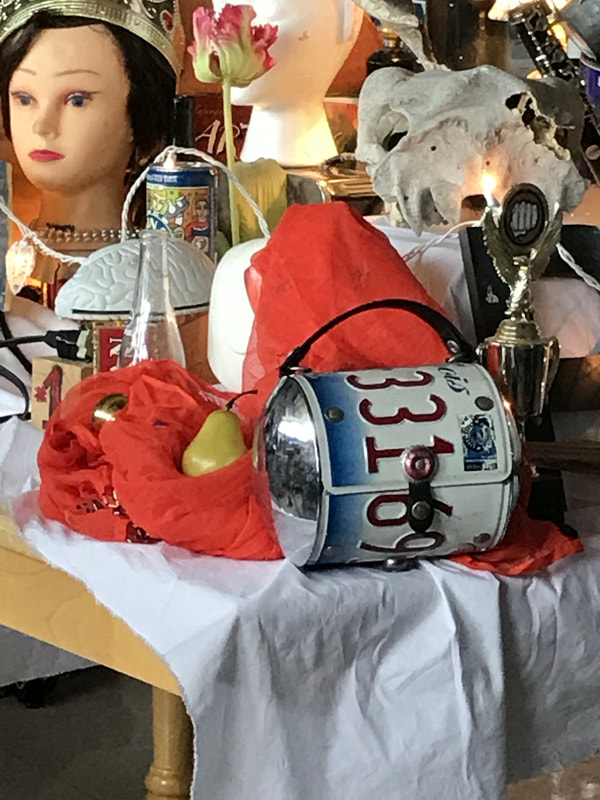
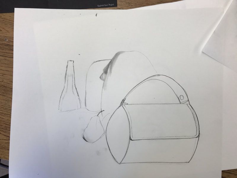
Numbers
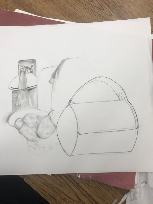
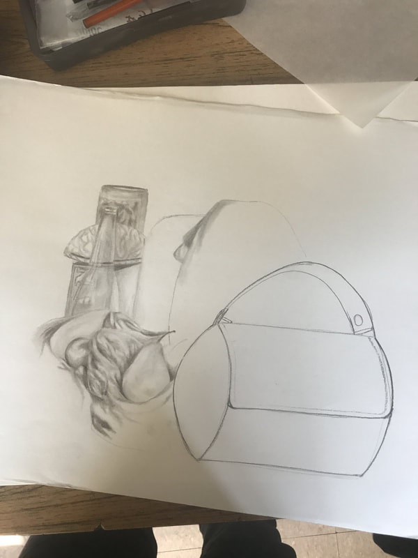
This image contains a license plate lunch box, a glass bottle, a brain paperweight, a pear, a reflective ball, and a cloth. Emphasis is placed on the lunch box, as it is the closest and darkest reflective object. The drawing also includes variety in respect to the shapes and textures of the objects. The use of line was especially important in creating the cloth in the picture; a strong line wouldn't be realistic, but too soft of a line wouldn't create depth. I chose this particular angle of the still life because I wanted to experiment with the clear reflections in the glass bottle. Furthermore, I enjoyed the way the cloth took up the extra space between objects. I titled this work "Numbers" because the numbers on the lunch box were the last things I drew, and I was nervous to draw them.
|
|
|
|
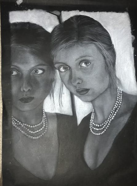
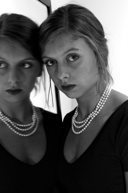
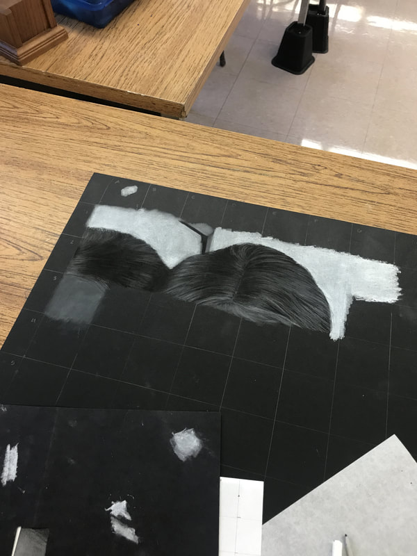
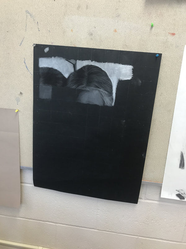
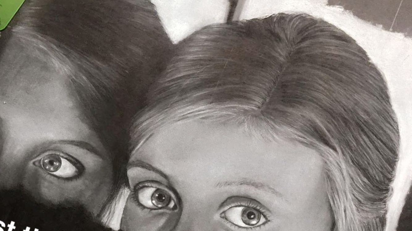
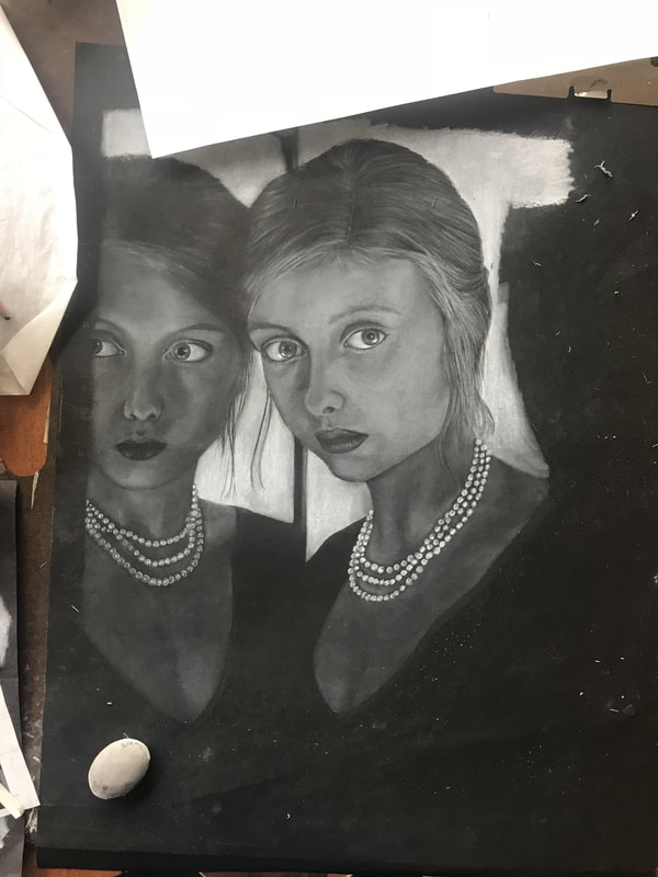
Mirror Image
The piece contains a girl with her figure reflected in a mirror. Emphasis is placed on the pearls because of their brightness, which contrasts with her shadowy skin. Texture can be seen in the model’s hair strands and in the smoothness of the pearls. The value of the reflection is considerably darker than the value of the girl standing by the mirror. The mirror aspect of the drawing was very important to me. When choosing a picture with reflection, I sought to find one with a clear mirror reflection, as I wanted to challenge myself to make the reflection look exactly as the reflected figure. The title, mirror image, is self explanatory.
|
|
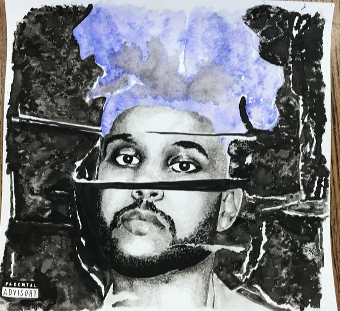
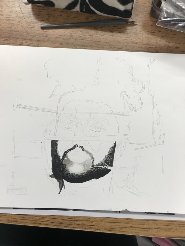
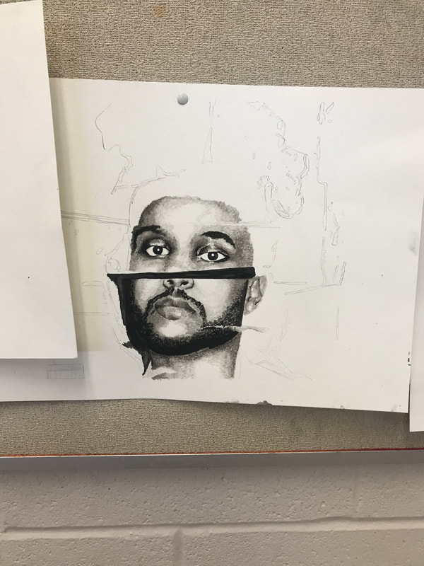
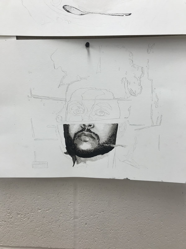
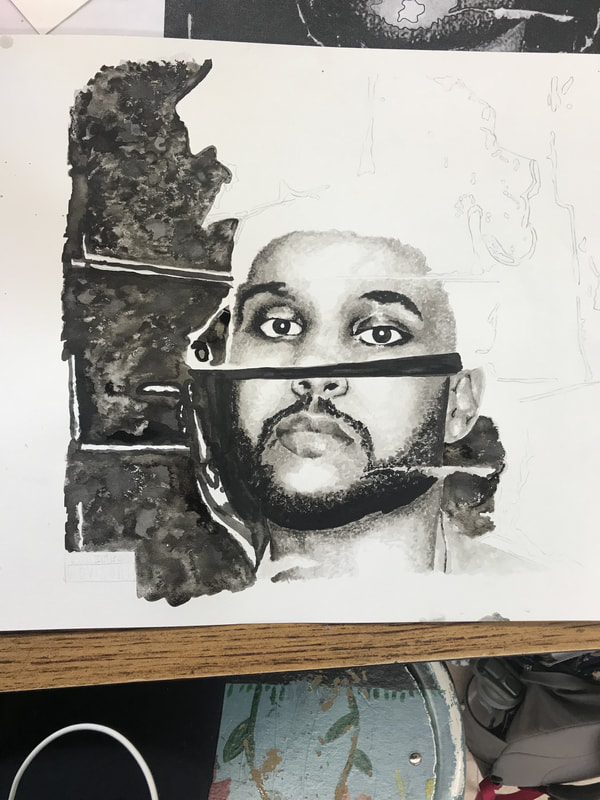
Beauty Behind the Madness
The name of this ink portrait is “Beauty Behind the Madness.” The picture is the cover of the Weeknd’s first album, and the title is the name of the album. The image consists of a portrait of a man’s face surrounded by an effect of torn paper. I used texture in the hair in trying to create a smooth, yet bubbly surface. I utilized value in contrasting the dark background with the bright face. I placed emphasis on the hair by using a bright blue color. I added movement to the image by creating shadows with the nib and stippling. I challenged myself in creating various values in the face with one type of ink.


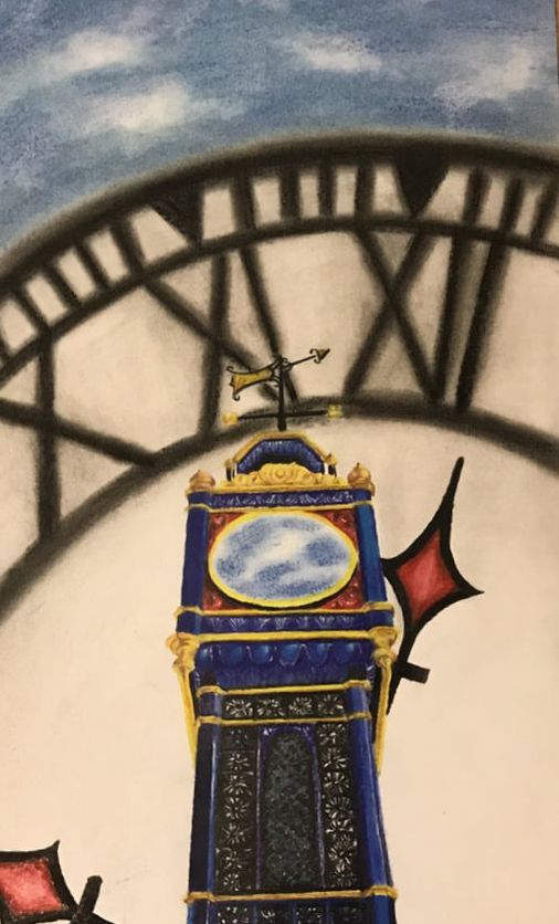
Time and Place
This piece is entitled "Time and Place" because the the clock within the tower and the background are both displaced to produce a surreal effect. The drawing has an element of line within the tower's build and detail. Texture is used to create shadows and highlights in the small, smooth crevices of the clock. Perspective is used in the angle at which the viewer sees the tower; it reaches upward towards the sky. Balance is used in the geometric shape of the tower, and emphasis is placed on the sky inside of the clock: the center of the drawing. Lastly, pattern is achieved in the repetitive detail of the clocktower.
